Coming onto the most crucial aspect of the app, the dreaded inspection process. A truck driver needs to inspect each vehicle that they are picking up to check for loose items, damages, and severity of damage. This is how the old process goes:
Step 1: Select Vehicle to inspect
On this page, the driver can see all the vehicles of the particular assignment. He can then pick which one to inspect first. In this example, there was just one vehicle in the assignment. We call them "Units". There can be up to 10 units per assignment.
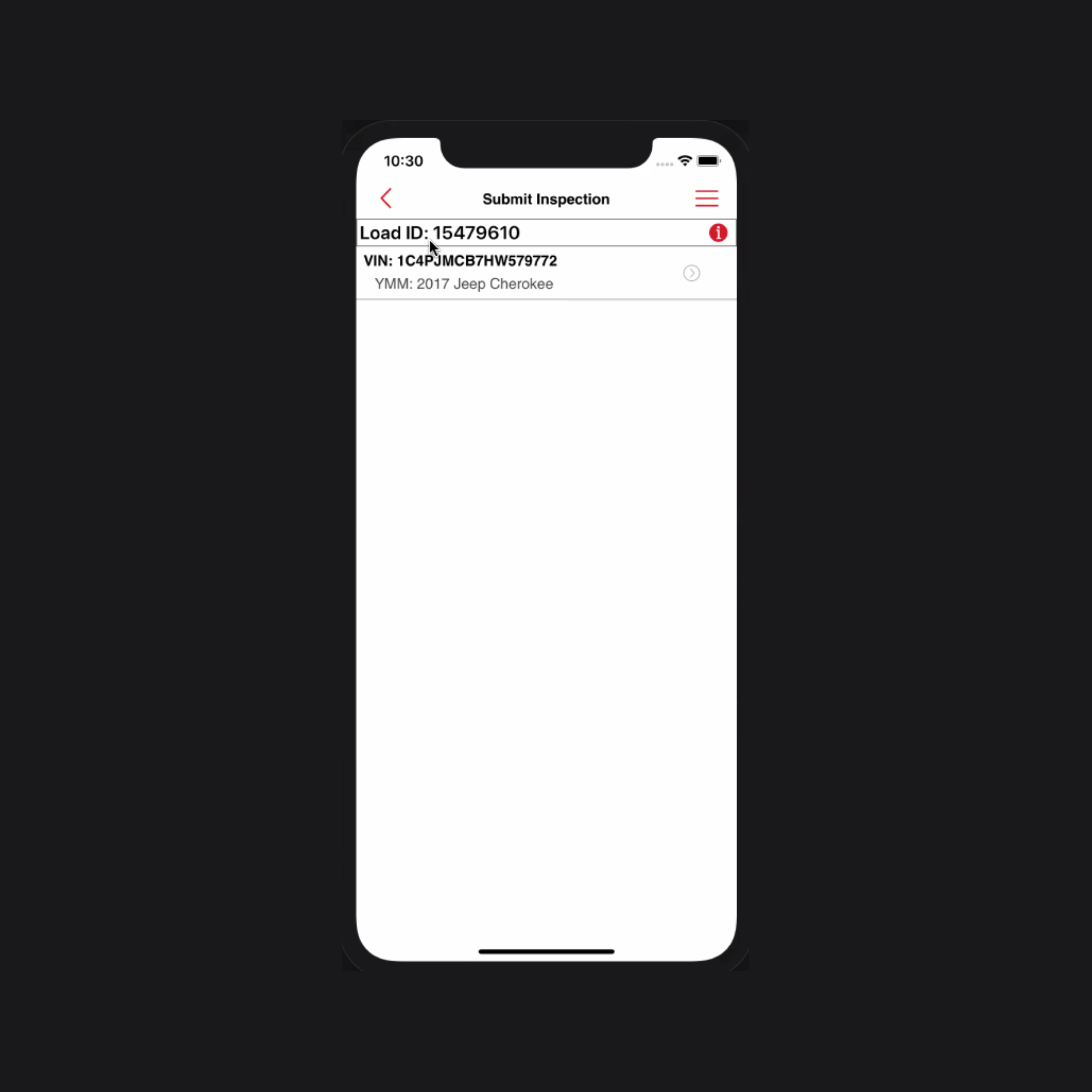
Selecting vehicles to inspect
Step 2: Select Type of Vehicle
In this step, the user simply needs to select the category of the vehicle.
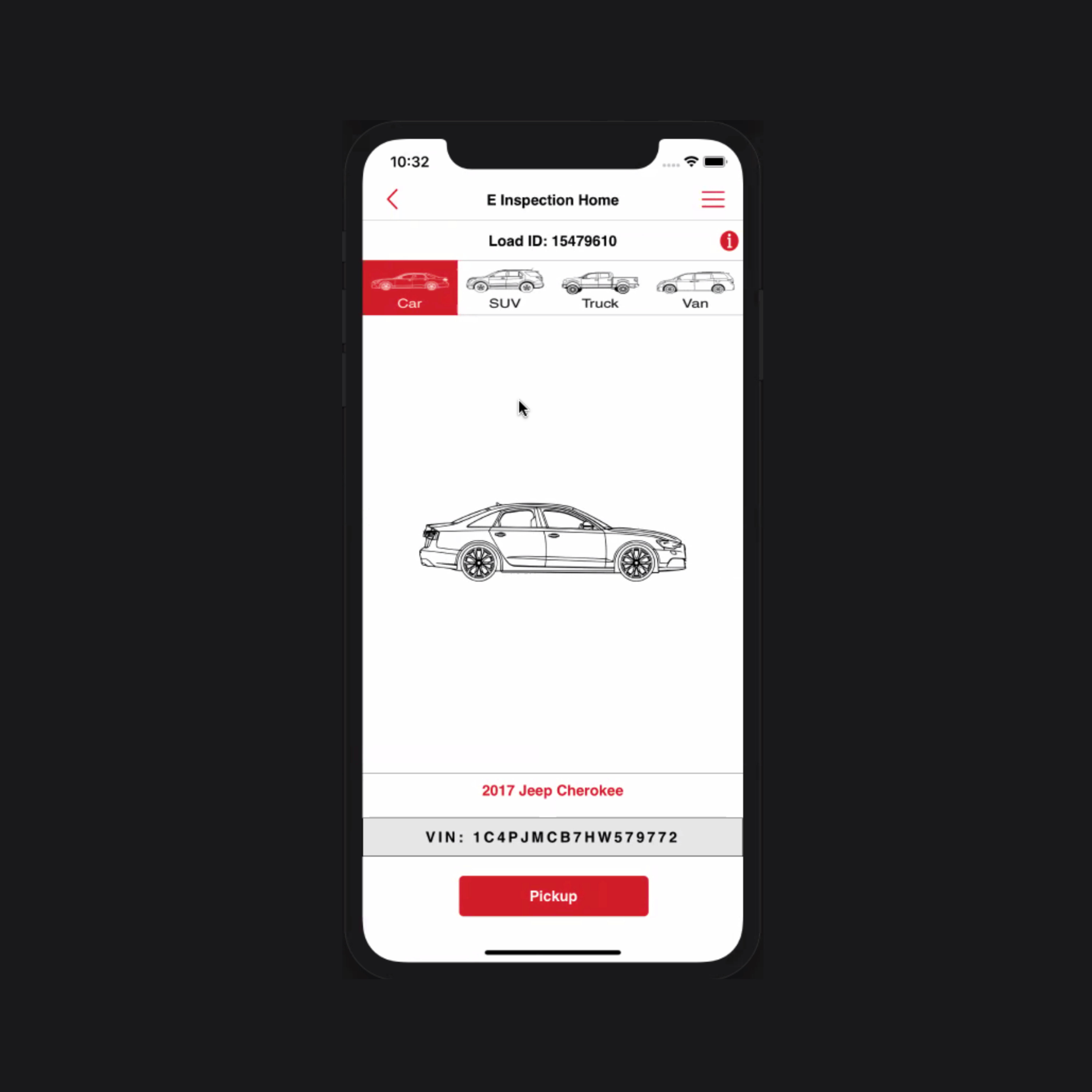
Select Type of Vehicle
Step 3: Windows Phone Layout Again!
The next step brings you back to the tile layout similar to the old Home Screen. From here, the driver can select either to do loose items inspection or vehicle inspection or click pictures.
⛔️ ISSUE: Adding an extra click or step for the user

Choosing the next steps
Step 4: Loose Items Inspection
Loose item inspection, as the name suggests, is the inspection of quantifiable things with a simple Yes or No answer.
⛔️ ISSUE: No default state. User has to choose an answer for every question
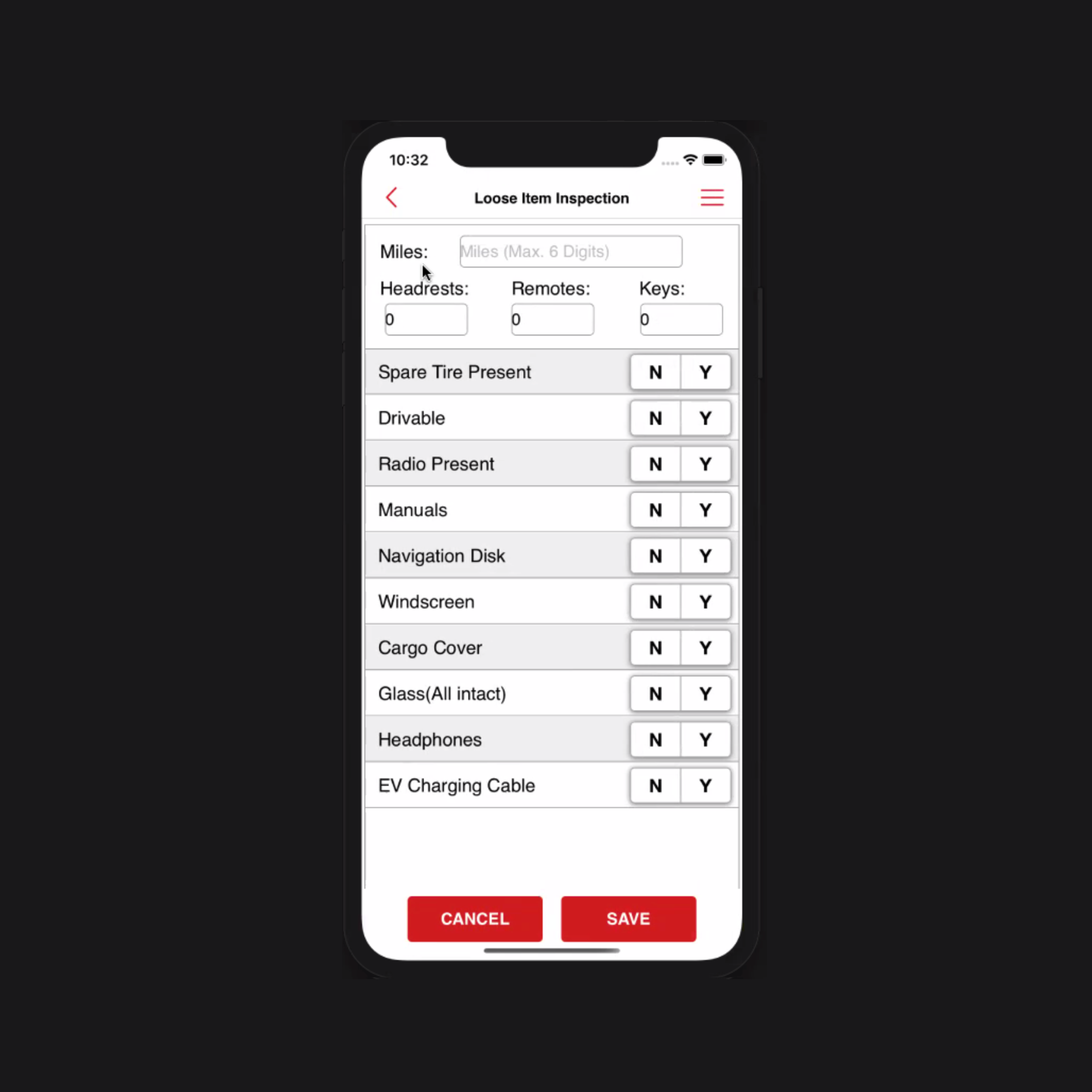
Loose Items Inspection
Step 5: Choosing the side to inspect
This is where the major part of inspection begins. The driver needs to select which part of the vehicle they want to inspect first.
⛔️ ISSUE: Additional clicks.
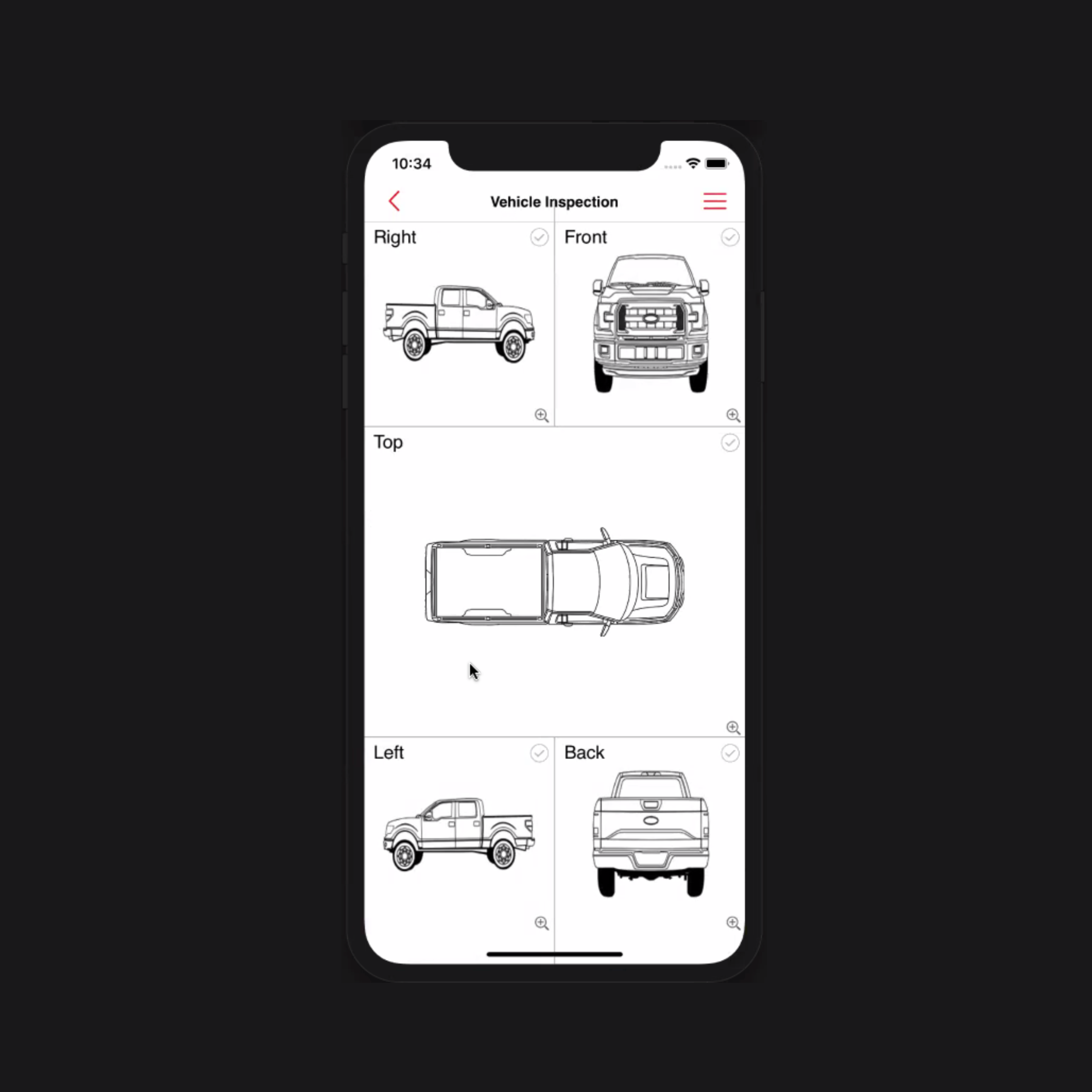
Choosing sides to inspect
Step 6: Damage identification
The driver needs to draw on a blueprint of the vehicle to mark where they see the damage. After that, they now have to go through 3 Additional steps to identify the damages.
1. Area: The user has to select which area of the car was damaged. For eg. front wheel, back wheel, etc.
⛔️ ISSUE: There were 21 options to choose from. Yes, 21!
2. Type: Now, the user has to select the type of damage. For eg. broken, chipped, sratched, etc.
⛔️ ISSUE: There were 17 options to choose from. And majority of those options were confusing.
3. Severity: After marking the area and type, next step was to mark severity of the damage. The user had to choose from options like 2.5 inch of diameter to 5 inch of diameter, 5.0 inch of diameter to 7.5 inch of diameter.
⛔️ ISSUE: There were 8 long and confusing options to choose from. Plus, these were not human readable in any way!
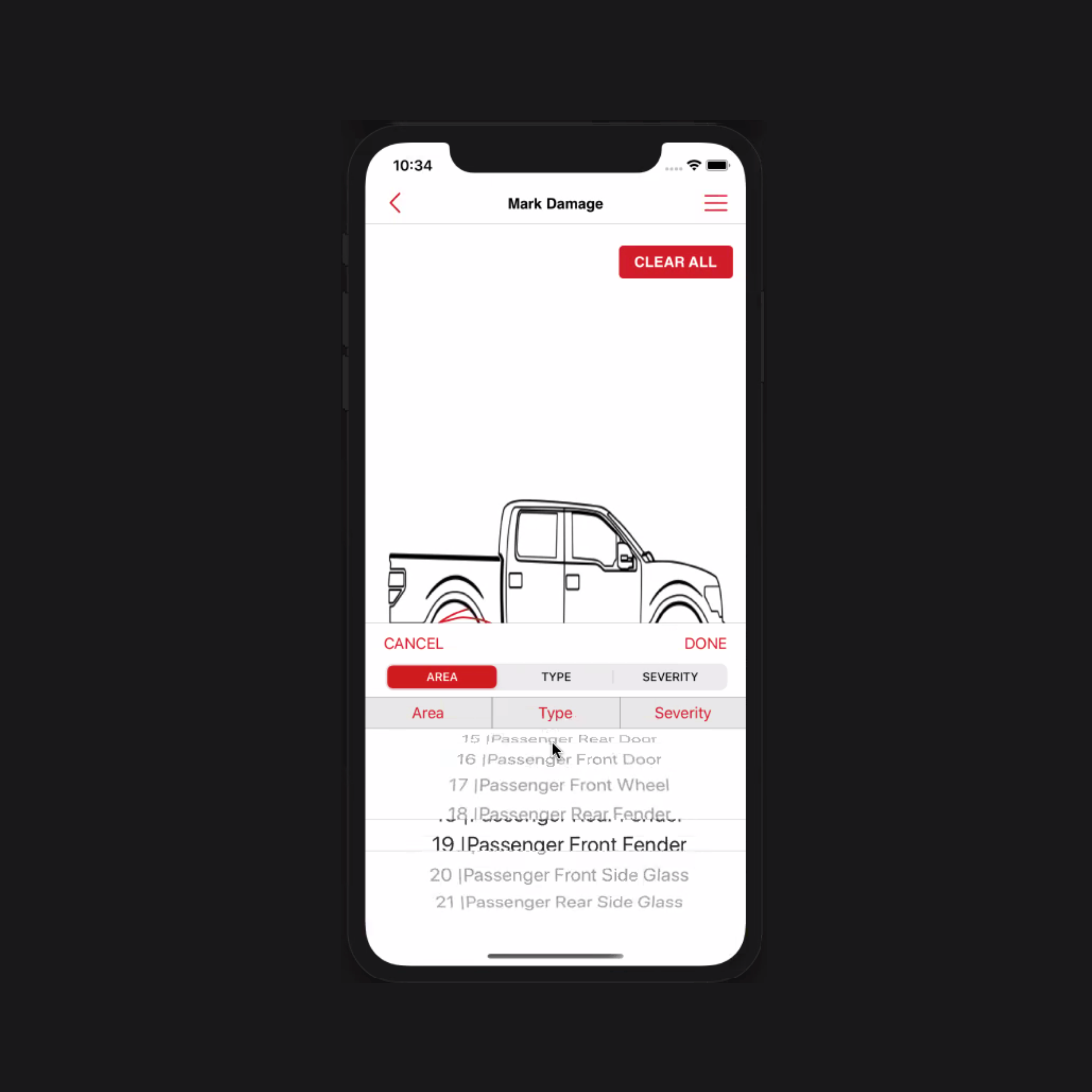
Confusing and long inspection process
Step 7: Signing off the parking lot
Once the inspection is done, the driver loads the vehicle onto the hauler truck and takes the signature of the agent in the origin digitally and takes off to the destination.
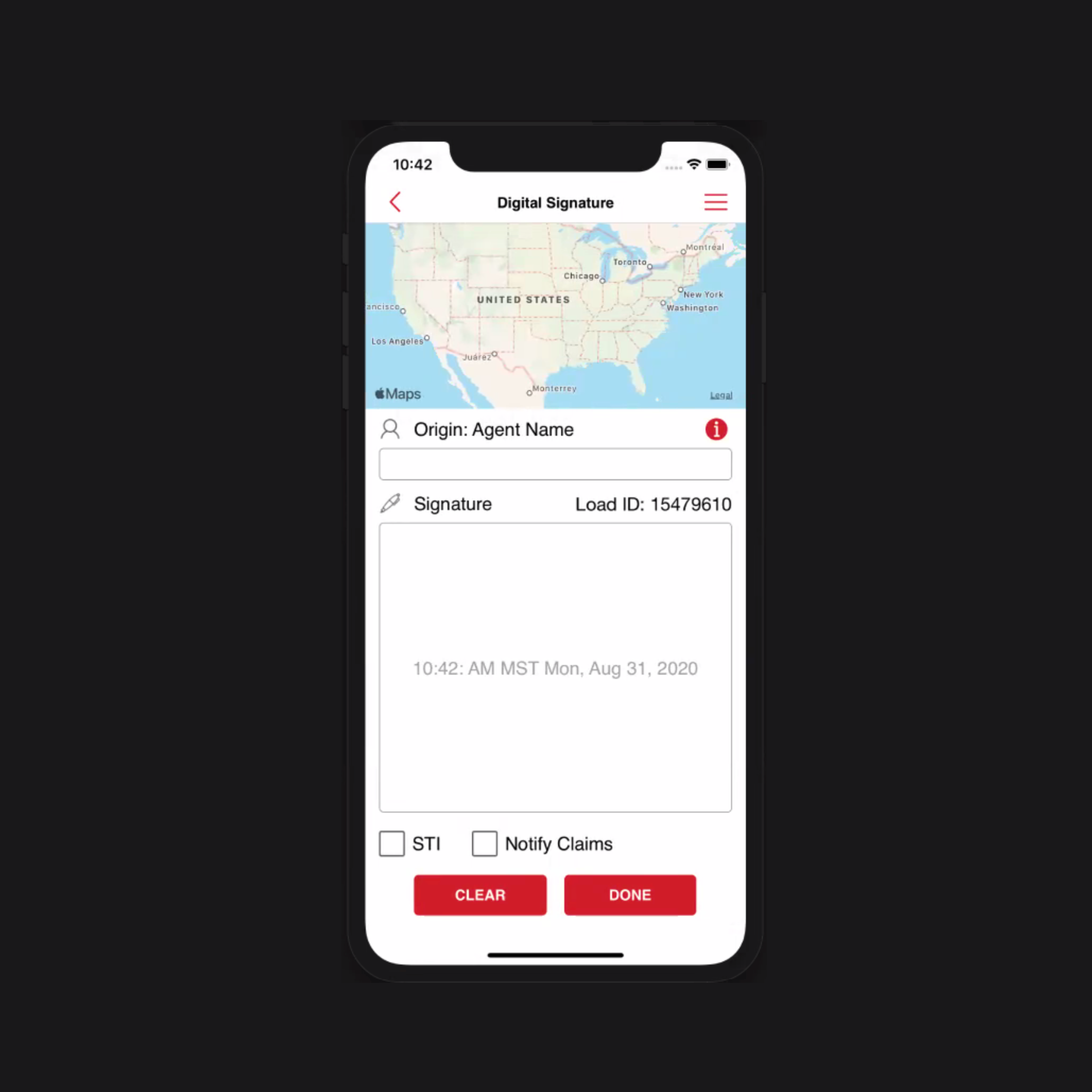
Signing off the parking lot


.svg)

